
Crafting the Perfect Barber Shop Logo

A great logo is more than just a cool design; it’s the face of your business. It’s out there 24/7, making a first impression on your behalf long before a client ever sits in your chair. The right barber shop logo builds trust and sets expectations, telling people exactly who you are.
Your Logo Is Your Silent Salesperson
Think of your logo as the handshake that greets every potential customer. Whether they spot it on your storefront, scroll past it on Instagram, or see it on a booking app, that single image has to communicate the entire vibe of your shop in a split second.
Is your place a classic, old-school haven for traditional cuts? Or is it a sleek, modern grooming lounge for the style-conscious guy? Your logo needs to answer that question instantly. It acts as a filter, attracting the people who are the perfect fit for your chairs and your culture. For a shop owner, that’s where the real value is. It's the difference between a random walk-in and a loyal customer who comes back every three weeks.
Lessons from Industry Leaders
Take a look at Fellow Barber in NYC. Their logo is a simple, clean, sans-serif wordmark. It immediately says "modern," "no-fuss," and "premium." They don't need to show you a pair of clippers because the typography does all the talking. It attracts a client who wants precision and current style.
Now, flip the script and look at Schorem in the Netherlands. Their logo is an intricate, vintage-inspired emblem packed with classic barbering imagery. It absolutely screams rock-and-roll and old-school authenticity. This thing doesn't just hint at what they do; it shouts it from the rooftops, helping them build a global cult following of guys after traditional pomps and classic shaves.
Actionable Takeaway: Your logo isn't just an expense; it's a strategic investment. A professional logo, which can run anywhere from $500 to $2,500, is a tool that builds your brand's value. If it helps attract just one new loyal client per month (average spend ~$40/cut), it can generate nearly $500 in new annual revenue per client, paying for itself quickly.
Ultimately, your logo sets the stage. It's the first promise you make to a customer about the experience they're going to have. It's a vital piece of your shop’s identity, influencing how people see you and whether they remember you.
If you want to dive deeper into building a powerful visual brand, check out our guide on the essential image of a barber shop. Putting in the effort upfront on your logo pays off big time, establishing a strong, recognizable brand that keeps your chairs full.
Key Ingredients of a Standout Barber Logo
What’s the real difference between a logo people forget and one that becomes iconic? It’s not just about a cool graphic. The best logos are a calculated mix of psychology, art, and solid business strategy, all working together to connect with your ideal client.
Before you even think about fonts or colors, you need to know exactly where your shop fits in the local scene. A practical guide to brand positioning mapping is a great starting point for this. Are you the premium spot, the traditional neighborhood classic, or the edgy, modern grooming lounge? The answer to that question drives every single design decision you'll make.
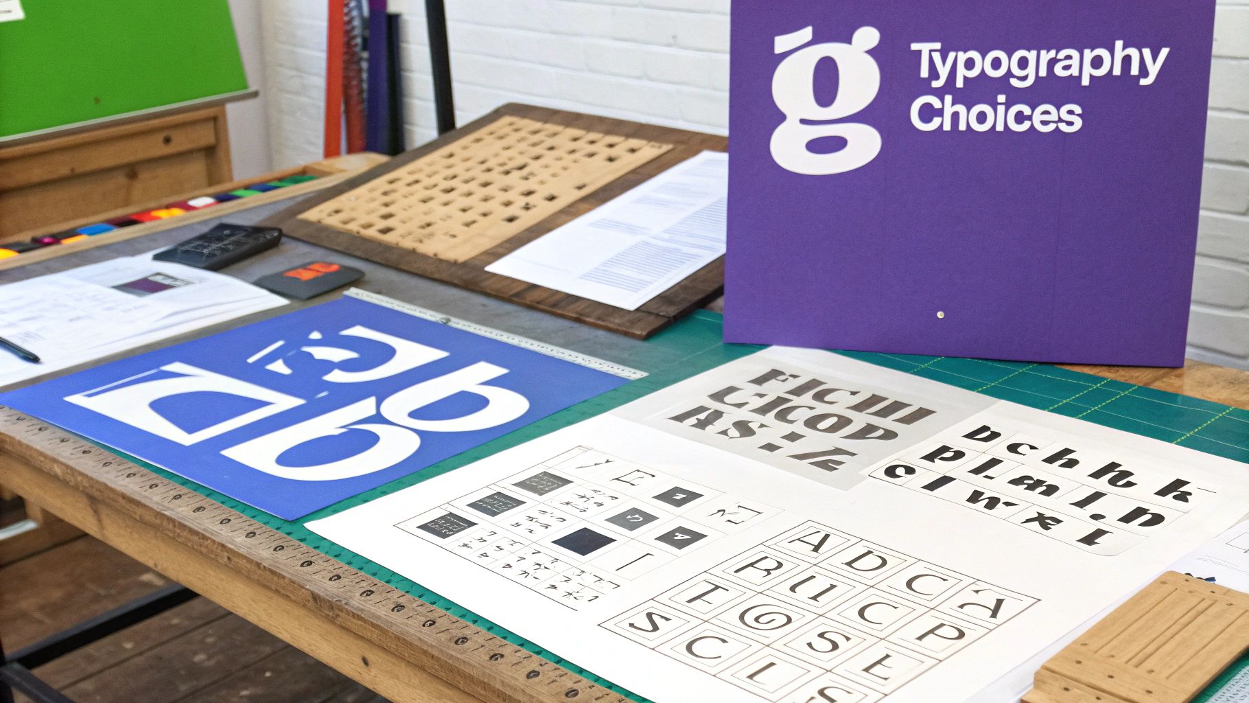
Mastering Typography and Tone
Think of your font as the voice of your brand. It can whisper sophistication or shout tradition from the rooftops. This choice is one of the first and most powerful signals you send to potential customers.
- Serif Fonts: Those little "feet" on the letters (think Times New Roman) are all about heritage, reliability, and classic craftsmanship. If your shop is built around traditional cuts and hot towel shaves, a serif font is a natural fit.
- Sans-Serif Fonts: Clean, direct, and modern, these fonts (like Helvetica) have no extra flourishes. They communicate precision and a contemporary feel, making them perfect for a modern grooming studio.
Just look at The Blind Barber. Their logo uses a bold, clean sans-serif font that immediately feels current and appeals to a younger, style-conscious crowd. The typography alone tells you this isn't your grandfather’s barber shop.
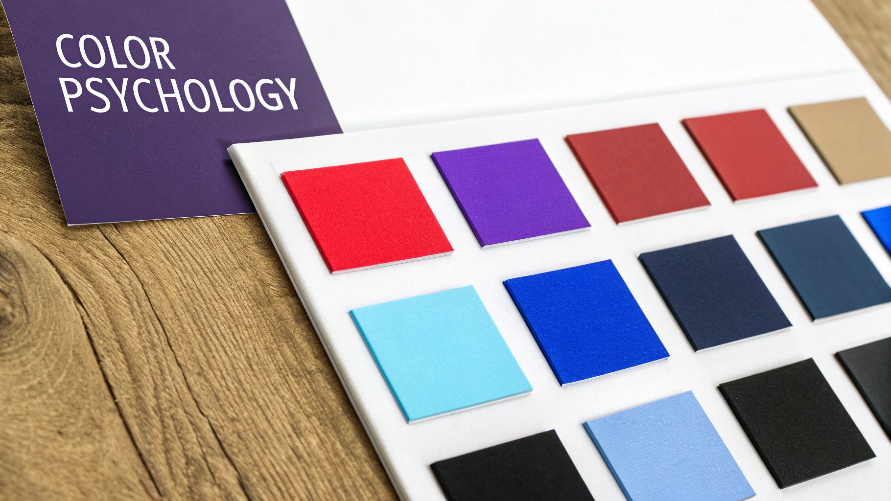
The Psychology of Color
Color is so much more than decoration; it’s a direct line to your customer's brain. The right palette can build trust and instantly convey the exact feeling you want people to associate with your shop. In the barbering world, a few color combinations have stood the test of time for good reason.
- Black & White: This classic pairing just screams sophistication and timeless style. A monochrome logo is incredibly versatile and always looks sharp, whether it's on a business card or a massive storefront sign.
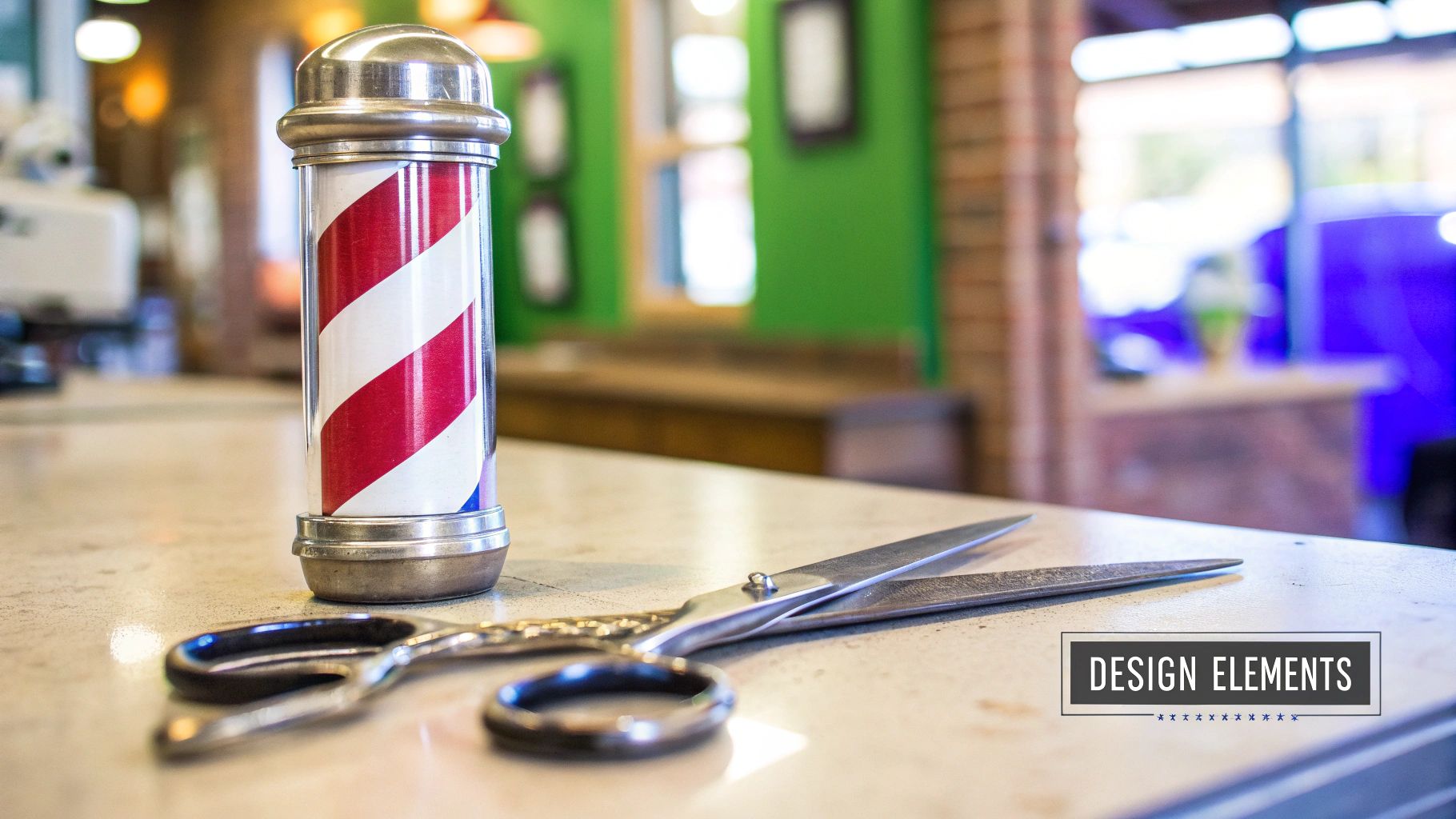
- Red, White & Blue: This is a direct nod to the iconic barber pole. Using this trio taps into a deep sense of tradition and authenticity, instantly telling everyone exactly what you do.
- Gold or Bronze Accents: Adding a metallic touch to a darker color scheme immediately elevates the perception of your brand. It suggests a premium, high-end experience where clients can expect nothing but the best.
Actionable Takeaway: Industry data shows that color can boost brand recognition by up to 80%. Choosing a palette that truly reflects your brand's personality isn't just an artistic decision—it's a critical business one that makes you more memorable than the shop down the street.
Choosing Your Logo Style
Finally, all these elements come together in a specific logo style. Each type has its own strengths, and the best one for you hinges on your shop's name and overall vibe.
- Wordmark: This is a logo that’s all about the name itself (think Google or Fellow Barber). It’s a great choice if you have a distinct and memorable business name.
- Emblem: Here, the text is woven into a symbol or icon, like the classic Harley-Davidson logo. This style projects a very traditional, established, and official feel.
- Combination Mark: This is the best of both worlds—a symbol paired with a wordmark. It's the most common and flexible style, allowing your brand to be recognized by either the icon or the name alone.
By carefully considering how typography, color, and style work together, you’re not just creating a pretty picture. You’re building a powerful tool that will attract the right customers and define your brand for years to come.
Balancing Tradition with a Modern Edge
Barbering is a craft steeped in history. Tapping into that heritage gives your brand an instant shot of authenticity—a sense of authority that a trendy, fly-by-night shop just can't buy. The real trick is to weave those classic elements into a logo that feels sharp and relevant right now.
You’re not trying to create a museum piece. The goal is to communicate experience and time-honored skill. Think of it as a subtle nod to the past, not a full-blown historical reenactment. This reassures clients that you respect the trade while still delivering the modern styles they want.
Modernizing Classic Barber Symbols
Everyone recognizes the barber pole. But just slapping it onto your logo can feel a bit on the nose. The secret is to deconstruct and reimagine these classic icons for today's audience.
- Abstract the Barber Pole: Instead of using the whole pole, why not incorporate its diagonal red and white stripes as a background pattern or a small accent? It’s a powerful visual cue that gets the message across without being so literal.
- Update Classic Tools: A straight razor or shears are great symbols, but they can look dated. Try rendering them in a minimalist, clean line-art style instead of a detailed, old-timey illustration. This simple shift makes the icon feel much more contemporary.
- Embrace Emblem Shapes: Shields, crests, and circular emblems have a classic feel that signals stability and tradition. When you pair one of these timeless shapes with a sharp, modern font, you strike that perfect balance between old and new.
The history of the barber pole is pretty wild—it dates back to when barbers also performed minor surgeries. Red symbolized blood, white stood for bandages, and blue (often an American addition) represented veins. While its meaning has evolved, the pole remains iconic, even as sales for one major US manufacturer dropped from 5,100 poles per year in the 1960s to just 500 by 2010. You can discover more insights about the barber pole's history on designmantic.com.
Actionable Takeaway: A great modern-traditional logo feels both established and forward-thinking. It tells clients, "We've got the experience for a perfect classic cut and the skills to nail the latest trends." This dual appeal broadens your customer base significantly.
Case Study: The Modern Traditionalist
Take a look at a shop like Baxter Finley in Los Angeles. Their branding often features classic typography and simple, clean lines. It feels premium and established without leaning on cliché vintage illustrations. They prove you can signal tradition just through sophisticated font choices and a refined color palette. It’s a masterful blend of old-school cool and a clean, contemporary aesthetic.
Getting this balance right is crucial. It ensures your logo connects with your loyal older clients while still catching the eye of a new generation. Your branding should mirror your skills—bridging the gap between timeless techniques and current styles. For a great visual deep-dive, check out our collection of barbershop website inspiration.
How to Actually Get Your Logo Made
So, you’ve got a solid vision for your barber shop's logo. That’s the hard part done, right? Well, almost. Turning that killer idea into a professional graphic can feel like a big leap, but you've got a few solid paths to choose from. Each one comes with its own price tag, timeline, and level of involvement.
Making the right call here is a business decision, plain and simple. Let's break down the three main routes: hiring a pro, using a DIY tool, or running a design contest. I'll walk you through what to expect with each so you can figure out what makes sense for your shop.
Hiring a Professional Designer
This is the gold standard for creating a truly custom brand identity. When you work directly with a freelance designer or a small agency, you're not just buying a graphic; you're investing in a strategic partner. They'll dig deep into your shop's story, your ideal client, and what the competition is doing to build a logo from the ground up.
Expect to invest anywhere from $500 to $2,500, sometimes more, depending on the designer's reputation and how much you need. It's the priciest option, but the payoff is a unique, memorable logo that works hard for your business. When you’re ready to get serious, it’s often time to look for professional custom logo design services to bring your vision to life.
To make this partnership successful, you need to come prepared with a clear creative brief. Don't hold back—the more detail, the better.
- Actionable Tip: Create a one-page "Brand Brief" for your designer. Include:
- Your mission (e.g., "The best hot towel shave experience in town").
- Three words to describe your shop's vibe (e.g., "Classic, masculine, relaxed").
- Your ideal customer's age, job, and style.
- Photos of 2-3 logos you love and 2-3 you hate.
Using a DIY Logo Maker
Just starting out or need something sharp, fast, and on a shoestring budget? A DIY logo maker is probably your best bet. Platforms like Canva or Looka use templates and AI to spit out a bunch of options based on a few prompts.
The cost is a huge plus, usually between $20 to $100 for a one-time download or a low monthly fee. The trade-off? Originality. Since your design is built on a template, there's a good chance you'll see other businesses out there with a strikingly similar look. Think of it as a great placeholder or a way to test the waters before you commit to a bigger brand investment.
This chart really drives home a key decision you'll face—color. It shows what other shops are doing, which can be a great starting point.
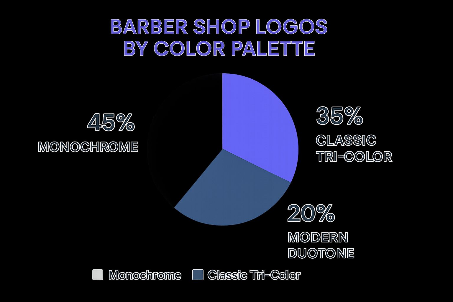
As you can see, monochrome and simple color schemes dominate. It's a clear signal that in the barbering world, a timeless, clean look often wins out.
Launching a Design Contest
Design contests sit in a nice middle ground. Platforms like 99designs let you tap into a global pool of creative talent without committing to a single designer from the start. You post your brief, set a prize (usually starting around $299), and watch as dozens of designers submit their concepts.
The biggest advantage here is variety. You get to see your idea interpreted in ways you might never have imagined. It’s a fantastic way to explore different creative directions.
The catch is that you become the project manager. You'll need to provide clear, consistent feedback to guide the designers toward what you want. It's more hands-on than hiring an agency, but for a fixed price, you get a ton of options to choose from.
Deciding on the right path comes down to weighing your budget, timeline, and need for a one-of-a-kind design. Here's a quick comparison to help you see how they stack up.
Logo Creation Method Comparison
| Method | Typical Cost | Average Timeline | Best For |
|---|---|---|---|
| Professional Designer | $500 - $2,500+ | 2 - 6 Weeks | Businesses seeking a strategic, unique, and high-quality brand identity. |
| DIY Logo Maker | $20 - $100 | Under 1 Hour | New shops on a tight budget or those needing a temporary logo quickly. |
| Design Contest | $299 - $1,200+ | 1 - 2 Weeks | Owners who want to see a wide variety of creative concepts at a fixed price. |
Ultimately, there's no single "best" way to get a logo. The best method is the one that aligns with your shop's current needs and future ambitions.
Putting Your New Logo to Work Everywhere
A great logo is just a starting point. Its real power comes from being seen—everywhere, consistently. Now it's time to roll it out across every touchpoint, turning that graphic into a hard-working asset for your business.
This is how you build brand recognition from the ground up. Think about it: a client sees your logo on Instagram, recognizes it on your front window, and then sees it again on the cape they wear in the chair. That seamless experience builds trust and immediately makes your shop feel professional and established.
Mastering Your Logo File Formats
Before you start sending files to printers or uploading them online, you have to get a handle on the different formats. Using the wrong one is a rookie mistake that can lead to blurry, pixelated graphics that undermine your professional image.
Vector Files (.AI, .EPS, .SVG): These are your master files. Seriously, they're the most important ones you'll get. Vector graphics are built with math, not pixels, which means you can scale them to any size—from a tiny icon on a business card to a giant billboard—and they will never, ever lose quality. These are what you'll send to any professional printer for signs, apparel, and merch.
Raster Files (.PNG, .JPG): These are pixel-based images, perfect for anything on a screen. Think websites, social media profiles, and your online booking page. A .PNG with a transparent background is your best friend here. It lets you place your logo over photos or colored backgrounds without that ugly white box around it.
Actionable Takeaway: Never accept just a JPG from a designer. A complete logo package is non-negotiable. Insist on getting all the key file types, including the original vector files (.AI or .EPS), print-ready PDFs, and web-ready .PNGs in both full-color and single-color versions.
Your Essential Brand Deployment Checklist
With the right files ready to go, it’s time to get your new brand out there. This isn’t just about slapping your logo on stuff; it’s about creating a cohesive, memorable experience.
My advice? Start with the high-impact items first. Your physical storefront and your digital presence are where new clients will find you, so nail those right away.
Here’s a practical checklist to guide your rollout:
- Physical Shop Assets (Priority 1):
- Storefront Signage & Window Decals
- Appointment & Business Cards
- Barber Capes & Towels
- Station Mirrors & Product Displays
- Staff Uniforms or T-shirts
- Digital Brand Assets (Priority 2):
- Website & Online Booking Page (like your Cuts.site profile)
- Social Media Profiles (Instagram, Facebook, TikTok)
- Email Signatures & Newsletters
- Digital Receipts & Invoices
Even in a digital world, a well-designed business card is a powerful networking tool. To make yours stand out, check out our guide on creating effective barber business cards.
There's so much history in barbering, and your brand can tap into that. For instance, the Montreal Canadiens hockey team famously wore a 'barber pole' jersey back in 1912-1913 as a nod to the trade's cultural weight. You can learn more about the history of the barber’s pole on Wikipedia.
When you consistently apply your logo everywhere, you’re doing more than just decorating your shop—you’re building a brand that people recognize, trust, and keep coming back to.
Answering Your Top Questions About Barber Shop Logos
When you're getting a logo made, a lot of questions pop up. It's completely normal. Getting good answers is what helps you make the right call for your shop and invest your money wisely. Let's tackle some of the most common questions I hear from shop owners.
How Much Should I Really Budget for a Professional Logo?
This is usually the first question on everyone's mind. For a genuinely custom logo from an experienced freelance designer, you can expect to invest anywhere from $500 to $2,500. The final price tag really depends on the designer's reputation and how deep the project goes.
I know, it's tempting to use those cheap DIY logo makers you see online, which often cost less than $100. But here's the thing: a custom logo is built from the ground up to attract your specific customers. It’s a strategic asset for your business.
A cheap template might feel like a win today, but it can hurt your shop's image down the road when you realize three other barbers in town have a similar look. Think about the return on your investment. If a strong, unique logo brings in just a handful of new regulars each year, it will pay for itself many times over.
What are the Best Colors for a Barber Shop Logo?
You can't go wrong with strong, classic colors. They just work. They give off a professional vibe and tap into the deep heritage of the barbering world.
Here are some tried-and-true options:
- Black, white, and grey deliver a timeless, high-end look that works absolutely anywhere.
- Red is a classic power move. It instantly connects to the history of the barber pole and brings a ton of energy.
- Gold or bronze accents are perfect for adding a touch of luxury, signaling to clients that you offer a premium experience.
Of course, the perfect color scheme comes down to your shop's unique brand. A sleek, modern spot might look incredible with a minimalist black-and-white design. A more old-school, traditional shop might feel more at home with deep reds and vintage creams.
Actionable Takeaway: One of the biggest mistakes I see is using way too many colors. Stick to a simple palette of two or three main colors. This will keep your logo looking clean, sharp, and instantly recognizable on everything from your front window to your Instagram page.
What Logo File Formats Do I Absolutely Need?
This part is not up for debate. To look professional and operate smoothly, you need your logo in both vector and raster formats. If you don't get the right files from your designer, you're setting yourself up for blurry, pixelated headaches later on.
Make sure your designer delivers these non-negotiable files:
- Vector Files (.AI, .EPS, .SVG): These are the gold standard. You can scale them to any size—from the corner of a business card to a massive billboard—and they will never, ever lose quality.
- Raster Files (.PNG, .JPG): These are your go-to for anything on a screen, like your website or social media posts. The single most important one? A .PNG file with a transparent background. Trust me, you'll use this one constantly.
Ready to give your barbershop the professional online presence it deserves? Cuts.site creates a sleek, all-in-one bio site that syncs with your Square booking system, showcasing your services, barbers, and location effortlessly. Get your site up in minutes at https://cuts.site.


")
